Minor The bundle_configuation object was misspelled in the cart, cart items, and order items. Therefore, on October 18, 2022, we have deprecated bundle_configuation and recommend that you use bundle_configuration to create a bundle configuration. See Carts.
Elastic Path Changelog
Keep up with changes to Elastic Path services by subscribing to our RSS Feed, Atom Feed, or JSON FeedStudio Release 154 | October 13, 2022
Overview
Our last couple releases were smaller than normal and this release is why. 154 was a huge release with 2 new features, 4 major improvements and a handful of bugs and tweaks.
Banner Features
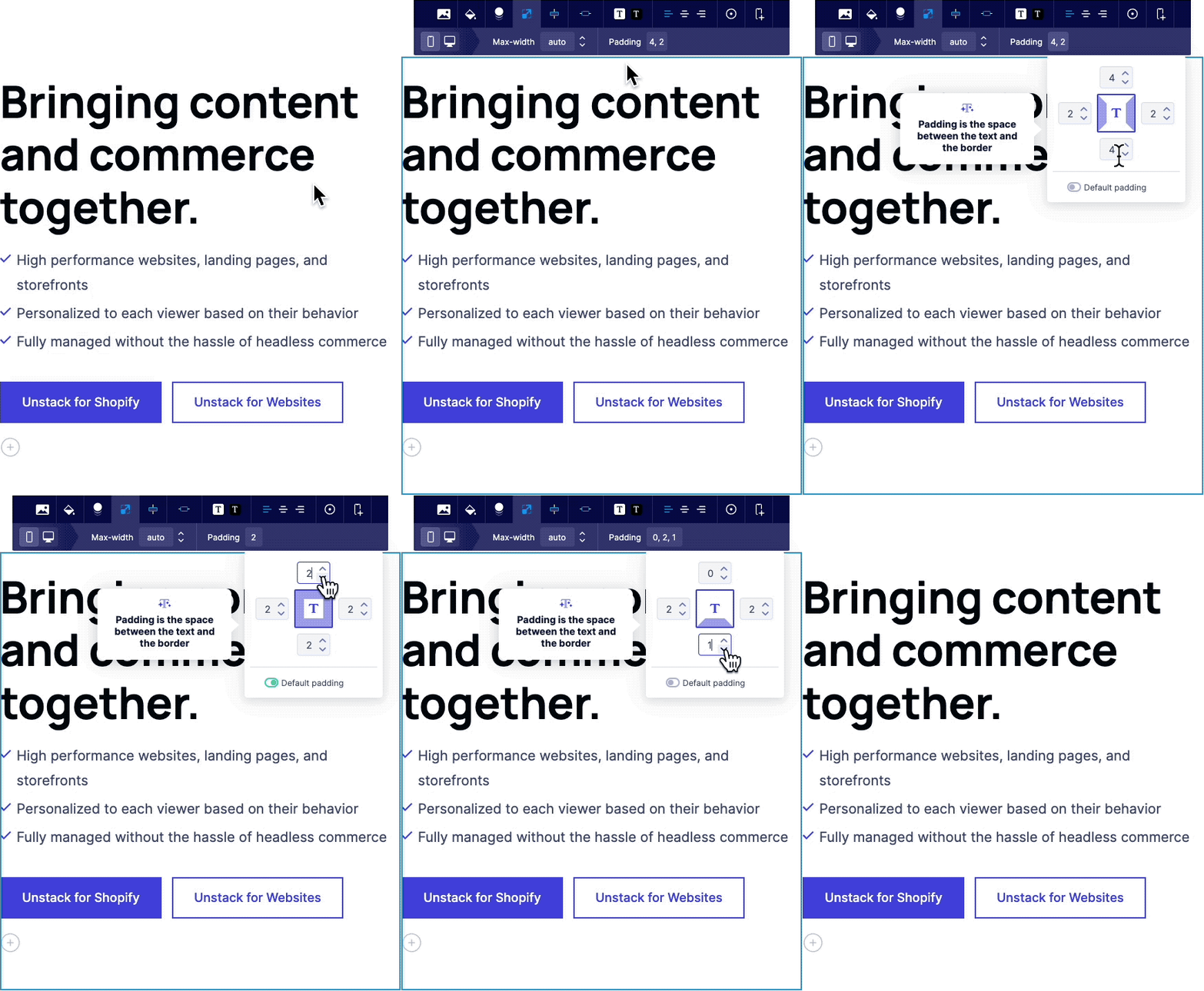
Mobile Padding
This feature allows users to customize their section padding, box padding, and max width on mobile.
Popover forms with Smart Links
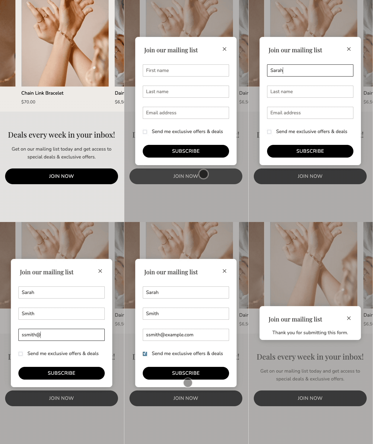
A first step towards 1st party pop-up support; you can now link directly to forms via our smart-linking system. This allows users to create popup forms that appear when a button is clicked.
Improved Gallery Component
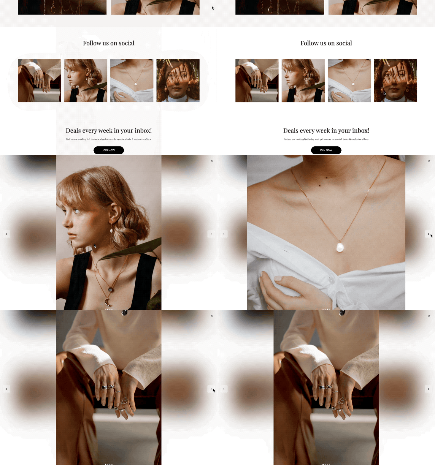
With this release we also shipped a new version of our "Gallery" component that include several improvements to both the mobile and desktop experience.
Improved Product Collection Component
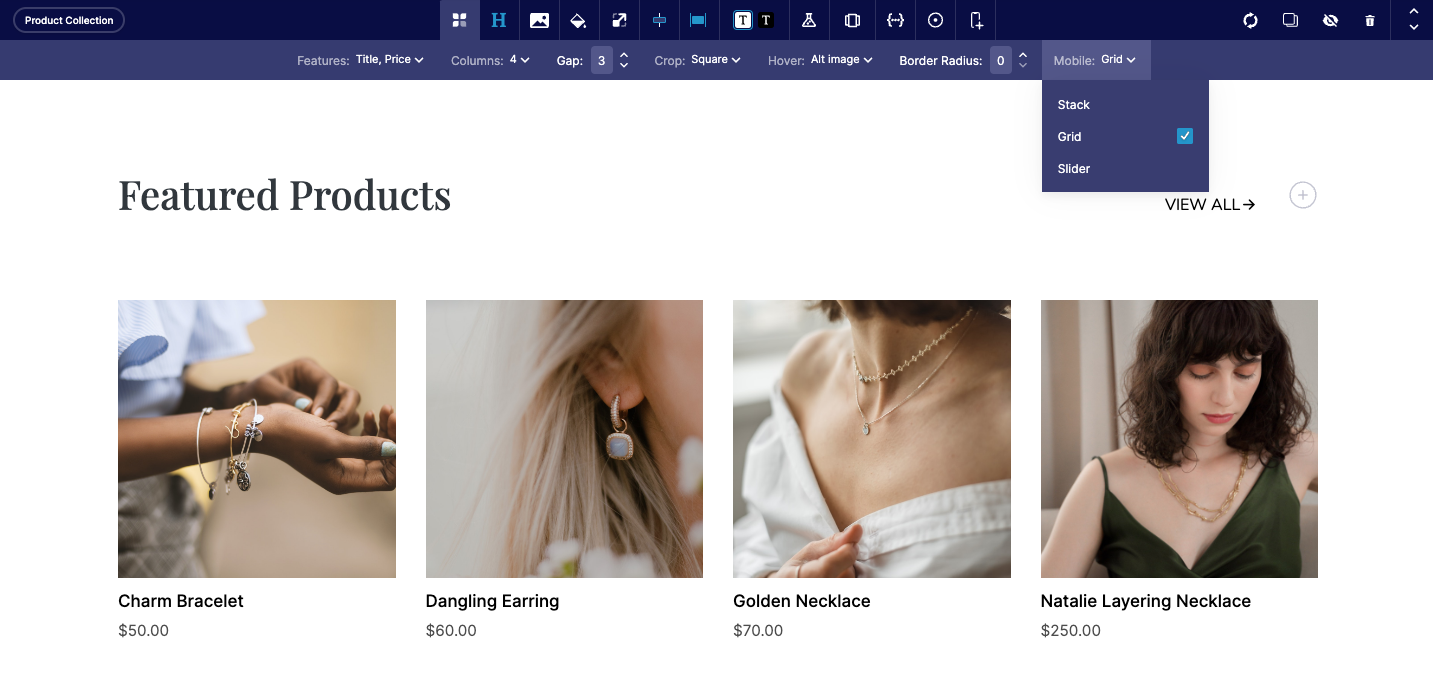
Following the changes we made to the gallery component, we realized that many of those updates could easily be pulled into our product collection component. Therefore we did just that. Now you're able to give a border radius to images and adjust the mobile experience.
Add-ons for product and media components
We also shipped improvements for both our Product and Media components. These improvements allow you to add banners or FAQs right to the "Text" areas of both components.
Complete List of Resolved Items
Mobile Editing & Preview
- Feature - Added size & spacing tab to house mobile settings
Component Updates
- Feature - Add-on support for the Product component which allows for FAQs or Callouts to be added to the text area of the section.
- Feature - Add-on support for the Media component which allows for FAQs or Callouts to be added to the text area of the section.
- Feature - Added border radius and mobile slider options to the Product Collection component
- Feature - Added smart link support for Unstack forms
- Feature - Overhauled the gallery component with tons of new features
Bugs & Tweaks
- Tweak - Made adjustments to collection queries to speed up load time.
- Tweak - Updated product component to use dynamic image sizing.
- Bug - Fixed issue with collapsing RichText on Firefox
- Bug - Fixed issue where the image in a media component wasn't loading properly
- Bug - Fixed an issue where starting to create a blog category, but then leaving before finishing, would crash the app
- Bug - Fixed an issue where the first section of a landing page (when viewed on mobile) was getting extra padding)
- Bug - Fixed an issue where default device visibility was using the wrong icon.
- Bug - Fixed an issue where new pages weren't showing up first in the "new pages" list
- Bug - Fixed an issue where parent boxes with properties collided with the properties of child boxes.
Changelog 2022-10-12
Major You can now create Application Keys, which are tied to the actual store instead of a user. This is helpful in avoiding scenarios like when a user in your organization leaves, then their user-specific keys leave with them. For more information, see Application Keys.
Additionally, we have moved all keys and credentials to Settings > Application Keys section in Commerce Manager. For more information, see Creating an Application Key.
Minor Commerce Manager: A new External Reference field allows you to store another unique ID with your PXM product. This could be a unique ID from another company system, for example. See Configuring Products in Product Experience Manager.
Minor Commerce Manager: When searching for products in Product Experience Manager > Products, you can now search on Description, UPC/EAN and, MPN. This is in addition to Slug, SKU and, Name. See Configuring Products in Product Experience Manager.
Studio Release 153 | October 4, 2022
Overview
Another small release with several bug fixes.
Complete List of Resolved Items
- Feature - Added support for style and other attributes to NoML tags
- Tweak - Updated Media component with mobile-specific settings
- Bug - Fixed issue where both the "Text" & "Media" components were missing box toolbars when they were added to * *Blog > Layout**
- Bug - Fixed an issue with button alignment in the callouts component
- Bug - Fixed an issue where new sections weren't getting the correct default width set
- Bug - Fixed an issue where the "gap" property that appears on some sections was also controlling vertical distance when the section rendered on mobile.
- Bug - Fixed an issue where long named variants in the product component would wrap to a second line.
Changelog 2022-09-28
Minor You can now exclude products from a promotion based on their attributes from cart-level promotions. For more information, see Create a Cart Fixed Discount Promotion and Create a Cart Percent Discount Promotion.
Minor Commerce Manager: New Attributes condition type in Add exclude > Condition Type field allows you to exclude products from a promotion based on their attributes from cart-level promotions. For more information, see Creating Cart-level Promotions.
Minor You can now see created_by and updated_by attributes to track changes made to a promotion in your store. For more information, see Promotions.
Minor You can use eq operator to search promotions using promotion codes. For more information, see Filtering with v2/promotions and Get all Promotions.
Studio Release 152 | September 26, 2022
Overview
A smaller release with a few bug fixes & tweaks.
Complete List of Resolved Items
- Tweak - Adjusted the link in the "Need Help?" widget
- Bug - Fixed an issue where the "Media/Text + Callouts" section was misaligned when added to a page where liquid header/footer was enabled.
- Bug - Fixed an issue where the "Media" component could be missing entirely from a page where liquid header/footer was enabled.
- Bug - Fixed an issue with the Shopify product sync where it would take a very very long time.
- Bug - Fixed drag & drop on our callouts components
- Bug - Fixed an issue where a user wasn't able to connect their Shopify store to Unstack
Changelog 2022-09-16
Minor Commerce Manager: New is and is like search operators are available in Product Experience Manager > Products. For more information, see Searching Products by Product Name, SKU and, Slug.
Changelog 2022-09-15
Minor You can now pay using Stripe Payment Element. For more information, see Elastic Path Payments Powered by Stripe.
Minor You can now void an authorization when an order with one payment transaction is in an authorized state. You can also void or cancel a payment if the order is cancelled.
Changelog 2022-09-12
Minor Commerce Manager: A new Hide Empty Template Fields toggle allows you to hide an attribute in your published catalog if no data has been set for the field. See Product Template Attributes.
Minor Commerce Manager:
- A new field Catalogs allows you to include catalogs to be applied for the promotion. For more information, see Creating Cart-level Promotions and Creating Item-level Promotions.
- A new field Products and Hierarchies > Enter by Hierarchy or Node allows you to include the hierarchies or nodes in the promotions. For more information, see Creating Item-level Promotions.
- A new field Excludes > Enter by Hierarchy or Node allows you to exclude the hierarchies or nodes from the promotions. For more information, see Creating Cart-level Promotions and Creating Item-level Promotions.
Studio Release 150 | September 12, 2022
Overview
This release includes several bug fixes, improvements to the help panel, and most excitedly... the option to show/hide certain sections or elements on mobile! 🎉
Banner Features
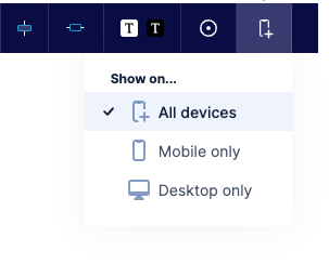
Mobile Visibility Options!
With this release we added the ability to control what devices you want to show sections or elements. You can now use these controls to show a section on all devices, mobile only, or desktop only.
Need help prompt
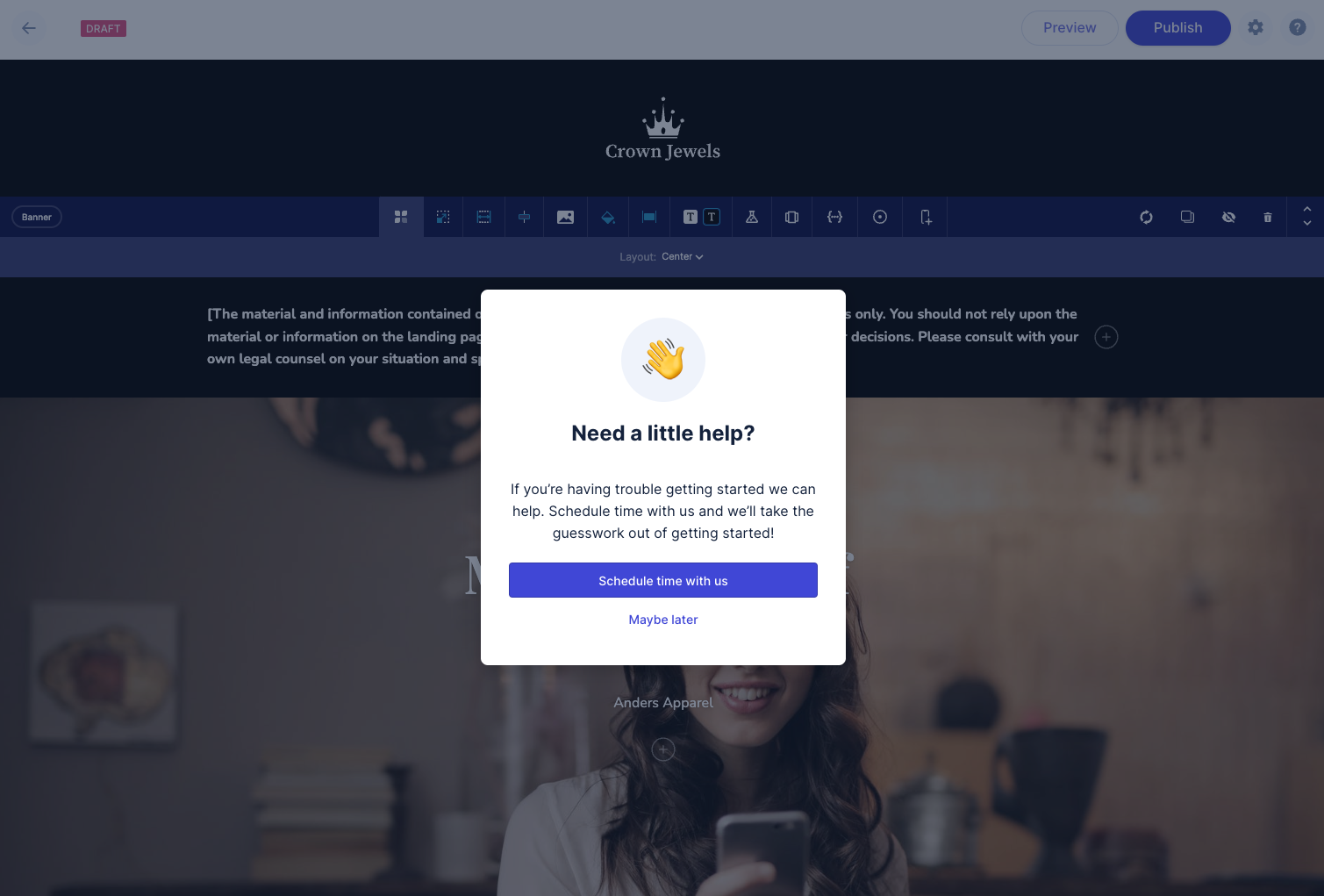
As part of the many ways we're trying to help people get set up on Unstack, we've added an in-app prompt in the editor that asks the user if they'd like to schedule a time with our Success team.
This prompt is shown to all users on pages that haven't been published (after the first day). After dismissal, it will be shown periodically until the account has sufficient publish activity (10 clicks on the publish button).
Help panel polish
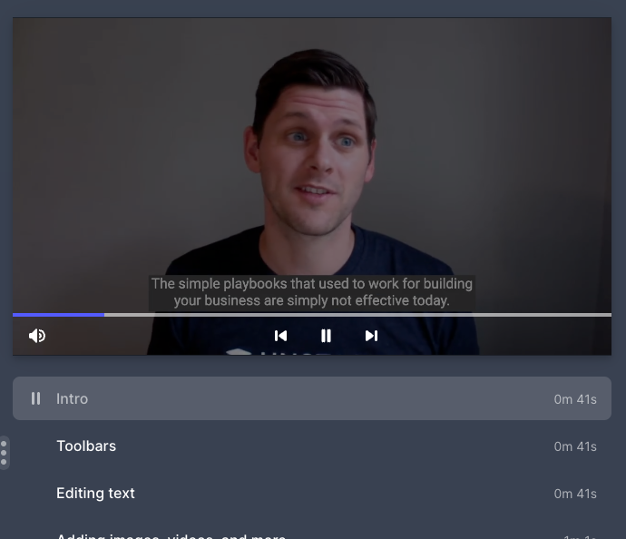
We've updated our help panel with better controls for the video and a smaller layout for smaller viewports.
Complete List of Resolved Items
Shopify
- Tweak - Previously, an empty billing info section was visible for Shopify Users in their account settings.
With this update we removed this section.
- Feature - Added "Need help" prompt to the editor
- Tweak - Improved the help panel to include better video controls & to more-easily display the content of the help panel on smaller viewports.
- Bug - Fixed an issue where the rendered version of the media component was missing it's media element when liquid header/footer was enabled on the account.
Page Editor
- Tweak - Adjusted the logic behind title updates to also update the page path of the page.
- Feature - Added support for showing/hiding sections and boxes on mobile.
- Bug - Fixed a bug where shadows weren't being properly applied to boxes.
Style Guide
- Tweak - Improved the diagrams used in the section padding & box padding sections of the style guide.
- Bug - Fixed an issue where the header of the Style Guide was located too far down the page.
Product Component
- Bug - Fixed an issue where selecting a variant in a product component would improperly change the picture
shown in the product component.
- Bug - Fixed an issue where the variant buttons the product component were not appearing properly in the editor.
Other fixes
- Bug - Fixed an issue where deprecated components couldn't be duplicated if already on a page.
- Bug - Fixed an issue where Firefox users weren't able to click "Manage Pages" in our embedded Shopify app.
- Bug - Fixed an issue with the layout of the background toolbar
- Bug - Fixed an issue where some images weren't rendering properly.
- Bug - Fixed an issue where the code block formatting options
- Bug - Fixed a header spacing issue that was causing the bag/cart icon to be offset.
Changelog 2022-09-09
Minor The in operator is now supported when filtering on Get all files endpoint. You can return a batch of specific files in a single request. For more information, see Get All Files.
Changelog 2022-09-08
Major A new Get a Product's Children endpoint retrieves a list of child products from a base product for a specified product and catalog release. For more information, see Get a Parent Product's Child Products.
Changelog 2022-09-07
Minor New bread_crumb_node metadata in a catalog enables you to see the nodes that product and nodes are associated with. For more information, see Catalogs.
Minor Fixed a bug where promotions were not applied when the currency of the item or cart does not match the currency of the promotion. When you apply the promotion, you will now get a promotion message indicating the currency mismatch. In this case, the promotion with the mismatched currency will be skipped, and any other applicable promotions will be applied. For more information, see Add Promotion to Cart.
Studio Release 149 | August 30, 2022
Overview
A solid release with new expanded component development features, several bug fixes, and an easier way for Shopify users to log in.
Banner Features
Element Properties
Expanding on the component property work that we've done over the last few months, this release introduces this functionality to individual elements within components. At the time of this release none of our components are using this functionality, but stay tuned in the coming weeks as we add some really neat features to our product & media components. 👀
Removing Unneeded Components
As part of our quest to make Unstack easier for customers to understand and use we deprecated a large number of media and text components. These components had features that aren’t commonly used and only added clutter when people were looking for the more commonly used components.
These changes reduce the total count of components to 30. That’s down from 60 in the spring!
Here’s the list of deprecated components:
- Media / Text + Features
- Media / Text + Features (Desktop App)
- Media / Text + Features (Mobile App)
- Media / Text + Logos
- Media / Text + Logos (Desktop App)
- Media / Text + Logos (Mobile App)
- Media / Text + Quote
- Media / Text + Quote (Desktop App)
- Media / Text + Quote (Mobile App)
- Media / Text + Isometric
- Media / Text + Isometric (Desktop App)
- Media / Text + Isometric (Mobile App)
- Media / Text + Stacked (Mobile App)
- Media with stacked callouts
- Text / 2 Column
In the page editor, these components will now have the “Deprecated” badge. They will continue to function as before, but you will no longer be able to add them to new pages.
Login with Shopify
We've added a “Sign in here” button for Shopify merchants! Clicking this button will take our merchants to Shopify where they can sign in and access Unstack.
![]Signing in(/assets/studio/Screen_Shot_2022-08-26_at_12.46.26_PM.png)
Complete List of Resolved Items
Element Properties
- Feature - Added support for Element properties on boxes.
- Feature - Added support for Element properties on other elements.
Shopify
- Feature - Added support for logging in with Shopify.
- Bug - Fixed an issue where deleted products weren't being removed from Unstack.
- Bug - Fixed an issue where accounts with expired trials were missing their products after the trial expired.
Editor
- Bug - Fixed an issue where the article editor was missing the (?) that opens the help panel.
- Bug - Fixed an issue where max-width was showing differently in the editor and rendered page.
Smart Links
- Bug - Fixed an issue where the smart link field would persist after linking a product.
Misc. Changes/Fixes
- Tweak - Updated the URL that the "Shopify + Unstack FAQ" link uses in the Quickstart.
- Bug - Fixed an issue where product inventory in Unstack would show negative values.
- Bug - Fixed a display issue with the add to cart modal.
- Bug - Fixed an issue where an unrelated logo was showing on Shopify 404 pages.
- Bug - Fixed an issue where the navigation header was pushed down.
- Bug - Fixed an issue where form settings were inaccessible.
- Bug - Fixed an issue where the header logo wasn't being properly centered on mobile or desktop.
- Bug - Fixed an issue where the add-to-cart button would sometimes appear greyed out despite having inventory
Changelog 2022-08-25
Major Commerce Manager: You can now manage catalog releases from Catalogs > Edit Catalog. For more information, see Editing Catalogs.
Minor Fixed a bug where promotions to carts were applied even when start date of the promotions was in the future.
Minor You can now see price without discounted amount and all the discounts applied in the meta object in carts and order items. You can also see the promotion id generated for the promotion. For more information, see Cart Items and Order Items.
Studio Release 148 | August 23, 2022
Overview
Given the scope/size of Release 148, this release was focused on a couple small changes, some internal tooling, and bug fixes.
Banner Features
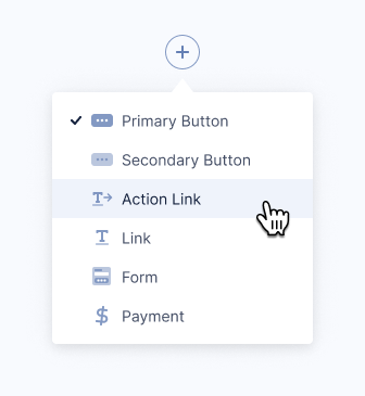
Updated Actions Menu
We updated our actions menu to simply the options and increase visibility on darker backgrounds. On the left is the new design; on the right is the previous design.

Updated Shopify APIs
Shopify deprecated a number of older APIs that we depend on so we updated our code to use the new APIs before the older APIs reached their end-of-life.
Complete List of Resolved Items
Editor Improvements
- Tweak - Fixed an issue where action items were overlapping with one another.
- Bug - Fixed an issue where the section and box toolbars would overlap with one another when selecting a fill color on some sections.
- Bug - Fixed an issue with the title position in the new editor header.
- Bug - Fixed an issue where "dark background" button styles weren't inherited properly.
Smart Links
- Bug - Fixed an issue where the smart link search would persist when editing the URL of a social logo in the
Footer.
- Bug - Fixed an issue where the smart link search would persist after selecting a product to link.
Banner Component
- Bug - Fixed an issue where the button in the banner was being cut off on mobile.
Shopify
- Tweak - Updated the Shopify APIs that we were using.
- Bug - Fixed an issue where accounts with expired trials weren't being asked to choose a plan.
- Bug - Fixed an issue where some "Add to Cart" buttons were greyed out despite the product being available and in-stock.
- Bug - Fixed an issue where some "Add to Cart" buttons weren't working properly on Firefox & Safari.
Misc. Improvements/Changes
- Feature - Improved the NoML around pagination for sliders.
- Feature - Created internal Zapier integration for our support, success, and marketing teams.
- Bug - Fixed an issue where some images with transparent backgrounds weren't rendering properly
- Bug - Fixed an issue where a small white margin was being added to the bottom of all pages.
Changelog 2022-08-17
Major New dynamic bundles allow your shoppers to choose their own options in a bundle. For more information, see Dynamic Bundles.
Major Commerce Manager: New dynamic bundles allow your shoppers to choose their own options in a bundle. For more information, see Create Bundles.
Major You can now cancel or void a pending transaction. For more information, see Cancel a Transaction.
Major You can now add exclude options under the schema object to exclude nodes and product SKUs for the following promotion types:
Major You can now define
target_nodesunder theschemaobject to include nodes for the promotion for Create X for Y Discount Promotion and Create X for Amount Discount Promotion.
Changelog 2022-08-11
Minor Commerce Manager: A new Accounts field allows you to select the account names of accounts eligible to view your catalogs. When a user has logged in with the account, they see the configured catalog. See Catalog Rules.
Changelog 2022-08-10
Minor Commerce Manager: You may have products with multiple templates, with each template having multiple attributes. A new Hide Empty Fields toggle allows you to only see the fields that have values set.
Studio Release 147 | August 10, 2022
Overview
With this release we added new trial functionality for Shopify users who add the app to their store. We also shipped a new editor header as well as an in-app help panel.
Banner Features
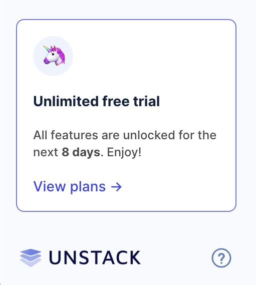
Unlimited Free Trials
As of today, new accounts through Shopify will start on a free trial plan that will last 14 days. Users on the free trial have access to all Unstack Landing page features. At the end of the trial, users are forced to choose a plan even if it means that they choose the Free plan in order to continue using Unstack.
New Editor Header & Publish Button
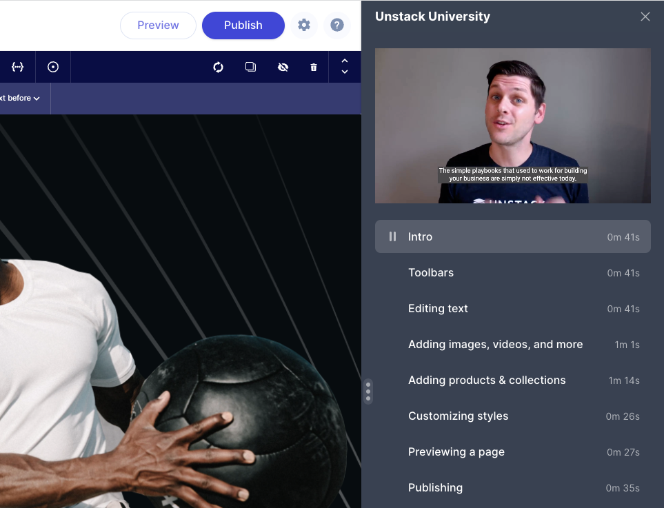
With this release we also add a new header for our page editor. This includes new preview & publish buttons. The new header makes the publish button more prominent removing the need for a second publish button. The hope is that the prominence will help improve publish rates.

Unstack University Help Panel
Along with the above-mentioned header changes we also shipped a new help panel for Unstack. This panel includes the chat widget that connects users to our Support team and also contains many help videos for getting started with the tool. Expect some more updates on this panel in the coming weeks.
Complete List of Resolved Items
Shopify Onboarding
- Feature - Added unlimited free-trial functionality for all Shopify plans. Also migrated any account that was
created before this release to the new trial plans.
- Feature - Added support for showing snapshots of any "drafts" a user might have created in Shopify's embedded app.
- Feature - New header for the page editor!
- Feature - New help panel within the page editor!
Reviews Component
- Bug - Fixed an issue where the color selector wasn't respecting the default value defined in the property.
- Bug - Fixed an issue where the selection made in the color selector wasn't respected in the rendered page.
Product Collection Component
- Bug - Fixed an issue where products in the collection component would sometimes "blink".
- Bug - Fixed an issue with the product collections component where the images would sometimes randomly change.
- Feature - Added a "show alt image" hover state to the product collection component.
Smart Links
- Tweak - Added smart-link support for any PDFs that have been uploaded to Unstack. You can now search for these
just as you would a page or product.
- Bug - Fixed an issue where products linked in an account's header or footer wouldn't open product selection modal.
Other Components
- Bug - Fixed an issue where the "Blog / Article Test + Images" component was using paragraph styles for the
article titles.
- Bug - Fixed a couple collisions where the new editing header wasn't appearing properly in Blog Layout or the Article Editor.
- Bug - Fixed an issue where a change to Blog Layout couldn't be changed.
- Bug - Fixed an issue where the text alignment options in a box wouldn't overwrite the text alignment options set at the text level.
- Tweak - In the Section/Component Editor, we're now mandating that elements be included in a
<section>tag. Now when you try to add an element outside of the<section>tag you'll be shown an error.
Other Changes
- Bug - Fixed an issue where "location" was missing from captured form values.
- Bug - Fixed an issue where custom form fields were not being displayed in customer entry.
- Bug - Fixed an issue where "Author" and "Tag" page views were not being recorded.
- Bug - Fixed a bug where accounts could get in a state that would return a 404 error when visiting /blog.
- Bug - Fixed an issue where certain images with their image-optimization settings would render as PNGs despite having the image-optimization setting set to "Resize/Next-gen Optimize"
- Bug - Fixed an issue with the Media/Text + Stacked (Mobile App) component had it's text cut off on mobile.
- Tweak - Adjusted the algorithm for optimizing images to use WebP for graphic images.
Changelog 2022-08-03
Minor A new external_ref attribute allows you to store another unique ID with your PXM product. This could be a unique ID from another company system, for example. See Create a product.
Changelog 2022-08-02
Major payflow_express and paypal_express endpoints are no longer supported. We recommend to use PayPal Express Checkout gateway. For more information, see Configure PayPal Express Checkout and PayPal Express Checkout Payments.
Changelog 2022-07-26
Minor You can now forward some additional parameters to your Identity Provider via the authorization endpoint. For more information, see Single sign-on with OpenID Connect.
Studio Release 146 | July 26, 2022
Overview
This release bookends a lot of the improvements in Release 143, Release 144, and Release 145 with some finishing work and a number of bug fixes. The most significant feature added is the ability to customize shadows in the style guide.
Banner Features
Shadow settings in the style guide
Full shadow customization is now available through the Style Guide!
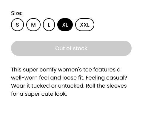
Out-of-stock products
The product component will now display “Out of Stock” on the add-to-cart button in addition to disabling it when the number of available products is less than 0.
Smart Link Polish
Some additional work was done on smart links to expand on current tooling and to squash some persistent issues with toolbar functionality.
Complete List of Resolved Items
Shopify
- Bug - Fixed an issue where navigation links in the liquid header/footer would appear differently in Unstack than they did in Shopify.
Editor Improvements
- Feature - Added support for pre-defined shadow settings in the Style Guide.
- Feature - Added NoML support for defining default shadows on components.
- Tweak - Adjusted box toolbars so they don't float over content when expanded.
- Bug - Fixed an issue where the default box shadow setting was not properly indicated in the box toolbar.
- Bug - Fixed an issue where the A/B Testing button would require two clicks to open sub-toolbar.
Smart links
- Tweak - Pushed several more stability updates for Smart Links
Components
- Tweak - Adjusted the text of the product component's Add-To-Cart button to say "Out of stock" when the product
is out of stock.
- Bug - Fixed an issue with the banner component where an applied background image wouldn't be displayed.
- Bug - Fixed an issue with the background color of the banner component not rendering properly
Style Guide Improvements
- Bug - Fixed an issue where the color selection drawer would show the color in RGB.
- Bug - Fixed an issue where Brand Primary was being set to "rgba (0,0,0,0)" by default.
Klaviyo
- Tweak - Refreshed client-side properties that are pushed to Klaviyo.
- Tweak - Cleaned up contact info in our database.
- Bug - Fixed a CSS collision issue with Klaviyo popover forms.
Customer Issues
- Bug - Fixed an issue where a user couldn't open their Style Guide
- Bug - Updated FAQ schema
- Bug - Fixed a product images issue
- Bug - Updated URL & OG URL definitions for author pages
Changelog 2022-07-21
Major You can now add exclude options under the schema object to exclude nodes and product SKUs for the following promotion types:
- Create a Cart Fixed Discount Promotion
- Create a Cart Percent Discount Promotion
- Create Fixed Discount Promotion for items
- Create Item Percent Discount Promotions
Major You can now define target_nodes under the schema object to include nodes for the promotion for Create Fixed Discount Promotion for items and Create Item Percent Discount Promotions.
Major Added endpoints that allow to read and write Time-to-live (TTL) settings for logs. For more information, see Logs Time-to-live (TTL) Settings.
Changelog 2022-07-19
Major You can now see the differences between the latest 2 catalog releases. See Publish a catalog.
Minor You can now get multiple stocks using implicit token. For more information, see Get Multiple Stocks.
Studio Release 145 | July 17, 2022
Overview
This was a huge release for us and broke (again!) the record for most number of shipped items in a release (previously held by Release 143. Highlights include improvements to Shopify product syncing, updated callouts components, and better handling of bad components in the editor. Also, a ton of bug fixes.
Banner Features
Better Shopify Sync
In this release, we’ve added support for Shopify webhooks which should remove the delay between making changes to products and sync. Webhooks allow Unstack to receive notifications from Shopify when products change and update the product immediately.
We also introduced an improvement to syncing media on the initial sync so that media will be synced as needed rather than delaying the initial sync. Importing media takes a lot of time, so doing this as needed should make the initial sync go faster.
Updated Callouts component
Following the changes we made to the media component in a previous release, the callouts component has also been updated to follow similar conventions.
All in all 7 components have been combined into two callouts components: icons and images. The new components allow you to adjust the number of columns on desktop and have styles for Cards and 3D Cards. Image cropping and icon size are also adjustable.
Deprecating older components
With the recent work on the media and callouts components, we can now deprecate 11 components that are no longer needed. All of the functionality in these components is available in our new updated components.
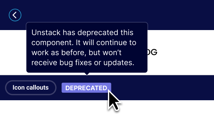
Going forward any component that has been deprecated will have a "Deprecated" badge in the editor and they will not show up as components that you can add to pages. This will ensure that sites continue to operate as expected, while also ensuring that new users aren’t overwhelmed by too many versions of the same component.
Better error handling for bad components
We've made improvements to the instances where poorly-implemented components crash. Now you'll see error messages for individual components when they fail to render in the editor and you can now delete them if you want to start over.
The aim here was to make it easier to identify and repair pages where components fail to render. Previously, the entire editor might crash when issues like these arose.
Complete List of Resolved Items
Product Component
- Tweak - Made a change to our backend logic when auto-resizing images.
- Bug - Fixed an issue where product images would sometimes be missing.
- Tweak - Made a change to our backend logic when auto-resizing images.
Product Collections
- Bug - Fixed an issue where the product collection drawer would load infinitely without returning results.
Editor Improvements
- Feature - Updated the editor so components that have crashed can always be removed within the editor.
- Feature - Updated error messaging when there are issues loading components in the editor.
- Feature - Implemented "Section-level" error boundaries to prevent the entire app from crashing when a component in the editor returns an error.
- Tweak - Adjusted the component list to no longer show deprecated components.
- Tweak - Pushed several updates for Smart Links.
- Bug - Fixed an issue where resizing a a browser window while working in the component editor would cause a crash in the app.
- Bug - Fixed an issue where item-preview pageview and form endpoint would return an "Item not found" error.
- Bug - Fixed an issue where the image placeholder in the "Box" component would return an error if certain layout options were selected.
- Feature - Updated the editor so components that have crashed can always be removed within the editor.
Style Guide Improvements
- Bug - Fixed an issue where large heading options would wrap to a second line in the text toolbar.
- Bug - Fixed an issue where the margin that headings had in the editor didn't match the rendered version of the headings.
- Bug - Fixed an issue where headings had a margin applied to them within the text toolbar.
- Bug - Fixed an issue where hex codes added without "#" wouldn't render correctly.
- Bug - Fixed an issue for a user who was unable to open their Style Guide.
- Bug - Fixed a spelling issue for the word "Vertical" in Style Guide > Forms > Spacing.
- Bug - Fixed an issue where large heading options would wrap to a second line in the text toolbar.
Smart Links
- Bug - Fixed an issue where Shopify users were able to find "Home Page" through the smart link toolbar.
Shopify
- Feature - Added support for screenshotting draft pages for use in page thumbnails.
- Feature - Updated sync job with webhooks to automatically detect changes to products and sync them accordingly.
- Feature - Improved media object syncing for Shopify objects.
- Tweak - Made changes to plan selection screen.
- Tweak - Updated sync job so that it no longer tries to sync inactive stores.
- Tweak - With the changes we've made to our sync jobs, we updated the text of embedded app to no longer mention an every 30 minute sync.
- Bug - Fixed an issue where the arrows for scrolling through landing page templates were not available.
- Feature - Added support for screenshotting draft pages for use in page thumbnails.
Data Driven Content
- Bug - Fixed an issue where the row options would be pushed out of view if the page slug was too long.
Components
- Feature - Added NoML support for custom properties on boxes.
- Feature - Added NoML support for custom properties on any element.
- Feature - Launched deprecation tooling for retiring older versions of standard components.
- Feature - Released new image callouts component
- Feature - Released new icon callouts component
- Feature - Deprecated old image callouts components
- Feature - Deprecated old icon callouts components
- Bug - Fixed an issue where FAQ components would break if a product component was also on the same page.
- Bug - Fixed an issue where the "Media/Text + Callouts" alignment wasn't working.
- Bug - Fixed an issue where some media boxes were missing their toolbar.
- Bug - Fixed an issue with embedded Vimeo videos.
- Bug - Fixed an issue where background images would appear differently in the editor than they did on the rendered page.
- Bug - Fixed an issue with the "Pricing/Table" component when used on a dark background
- Bug - Fixed an issue with the margin of the "Quotes" component.
- Bug - Fixed an issue with missing padding on the "Media/Text 8:4" component.
- Bug - Fixed a missing icon issue when the "Media/Text + Quote" section was loaded on a mobile device.
- Feature - Added NoML support for custom properties on boxes.
Customers/Contacts
- Bug - Fixed an issue with the customer list where creation dates were being ordered incorrectly.
Other
- Bug - Fixed an issue where Shopify 404 pages would show a random brands logo.
- Bug - Fixed an issue where DNS settings would not display properly.
- Bug - Fixed an issue where cloning a page would result in a 500 error.
- Bug - Fixed an issue where Shopify 404 pages would show a random brands logo.
Changelog 2022-07-13
Major Split Payments (Beta Release) are now available. For more information, see:
Major You can now add amount and paymentmethod_meta as optional fields for the payment methods. See Manual Payments.
Major You can now include or exclude variation options when building your child products. See Build child products.
Changelog 2022-07-11
Major A new custom_inputs attribute allows you to add personalized or custom text to a product that can be displayed in your storefront. For more information, see create a product.
Major A new custom_inputs attribute allows your shoppers to add personalized text to products when adding items to a cart. For more information, see Carts.
Changelog 2022-07-06
Major A new product import API is available that allows you to manage and upload your product data. For more information, see Import PXM Products.
Major Commerce Manager: You can now manage and upload your product data from Commerce Manager. For more information, see Importing Products.